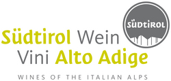
The objective of the new trademark is to help consumers easily identify Alto Adige’s quality product, and to give the region a visual, competitive edge among the international and domestic wine brands proliferating the marketplace. The new trademark is a modern interpretation of the Südtirol region’s pre-existing visual identity and was chosen for optimal marketing synergy between tourism and other local products. Using “Südtirol” in the logo also distinguishes wines from the autonomous region of Alto Adige from those of the Trentino area, which are often grouped together but are stylistically different. To reinforce the new positioning and strengthen the link between brand messaging and product, a uniform wine bottle capsule with the new logo stamped on the top will start appearing on bottles in early 2011. In the logo, the outline of mountains can appear in one of three colors – white, silver, or gold – as selected by each producer. The imprint on the capsule head functions as an additional point of recognition and a seal of origin for consumers. Christof Tiefenbrunner of the Tiefenbrunner Winery expressed high hopes for the new capsule. “On one hand, using a common capsule makes it possible for us to clearly differentiate ourselves from Trentino and the rest of Italy. It also offers the possibility of greater synergies long-term with the Südtirol Marketing Association, which will be to everyone’s advantage.”Regarding the monolingual “Südtirol” German inscription on the capsule, Klaus Gasser of the Terlan Winery commented, “We are fully aware that marketing, particularly in the beginning, will involve additional communication efforts, especially in countries such as the USA where Alto Adige is first and foremost known by its Italian name. It must be emphasized that the inscription in German affects only the capsule, the Italian name will remain on the wine bottle label. The capsule will gradually develop into a trademark that refers to our little winegrowing area and our high standards of quality.” (You can reach the writer at info@vitabella.fr)
Alto Adige Wines Introduces New Brand Identity

The Alto Adige Wine Consortium and the Export Organization Südtirol (EOS) have launched a new brand identity for the wines of Alto Adige. Located in Italy’s northeast corner, the Alto Adige region is also known as Südtirol (South Tyrol) stemming from its bicultural Italo-Austrian heritage. The new logo is comprised of the word “Südtirol” in a circle above a stylized mountain range with the two-toned, light green and grey inscription “Südtirol Wein – Vini Alto Adige.” The German-Italian inscription reflects the region’s bilingual tradition. The identifying image of the mountain range recognizes the uniqueness of the stunning Alpine landscape and demonstrates the local wine industry’s understanding that image is essential to capture consumers’ memory and imagination. In the US market, the logo will carry the tagline “Wines of the Italian Alps” as consumers here are more familiar with the Italian positioning. The logo’s light green tone graphically demonstrates the increasing prominence of white wines which currently make up 55% of Alto Adige’s vineyards.


